Amazon Stores: 5 Tips To Make Your Storefront Easy to Navigate

Since Amazon launched their brand-based eCommerce landing pages: Amazon Storefronts, third-party sellers have a way to display their value proposition, product catalog, and brand story, in a format that allows them to develop a deeper connection with Amazon shoppers.
Prospects can “follow” stores and get updates on promotions and social media style posts on the brand’s “Posts” page.
While third-party sellers have had access to Stores for a while now, many aren’t using it to their full advantage.
The main components of a Storefront are:
- Pages—which are assembled in the navigation menu
- Header/Hero Image
- Sections
- Tiles – Content widgets that range from text to images, videos, and products.
Currently, many Amazon sellers just have a header and product catalog on their Storefront.
Here are two examples:
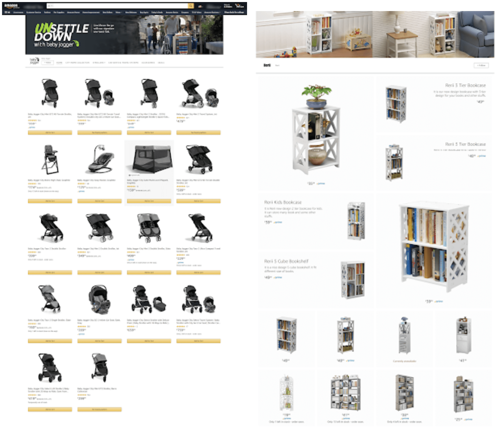
The problem is, this sort of layout doesn’t help the browsing consumer understand what they’re looking at, or why they should buy from you.
In this article, we’re going to cover five elements you might consider adding to your Amazon store so that it’s easier to navigate and increases your chances of converting visitors.
Tip # 1 – Category Breakdown
Today, if you browse through many Amazon Storefronts, you’ll see that many of them don’t have a category breakdown.
Some will have a section for best-sellers, or they’ll feature specific products, but nothing that organizes their entire product catalog.
This is a mistake.
When prospects are browsing Amazon, there are so many variables that can grab their attention, that if they land on your Storefront and you show them a bunch of random products—sometimes ones that don’t relate to each other—you’re forcing them to do extra work to process what you have to offer.
Sure, they may buy from you once, but you miss the opportunity to paint a picture of the value you add to the marketplace.
Here’s an example of a Storefront that clearly organizes its products into categories:
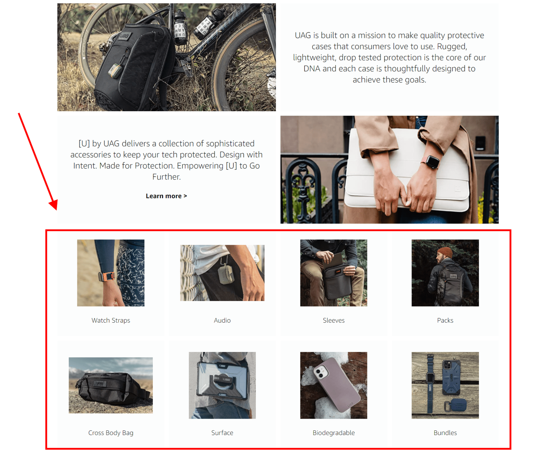
This store sells protective covers for electronics. The layout includes a few tiles that explain the brand’s value proposition, but then, right below that, they have a categories section.
Are you looking for watch straps? Want an Airpod holder? Need a laptop sleeve? These category tiles clearly display the line of products that this brand offers.
Here’s another example:
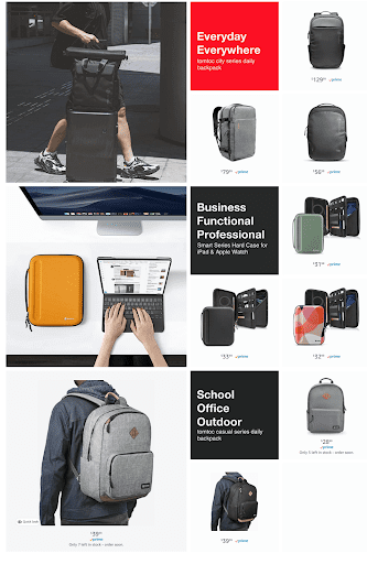
This brand sells bags. They did a great job on their storefront of dividing up their products by use-case. A prospect that wants an everyday carry bag lands on this Amazon store and can easily identify what bags may be most conducive for their needs.
Tip #2 – Navigation Menu
Depending on your product line, you want to spend some time considering what would be the best way to label the pages on your navigation menu.
Many brands automatically opt for choosing a list of categories for their store pages, but depending on your audience, it may be best to consider alternatives. Here are a few:
- Benefits
- Use-Case
- Who It’s For
Here’s an example of a Storefront that used benefits for their navigation menu:
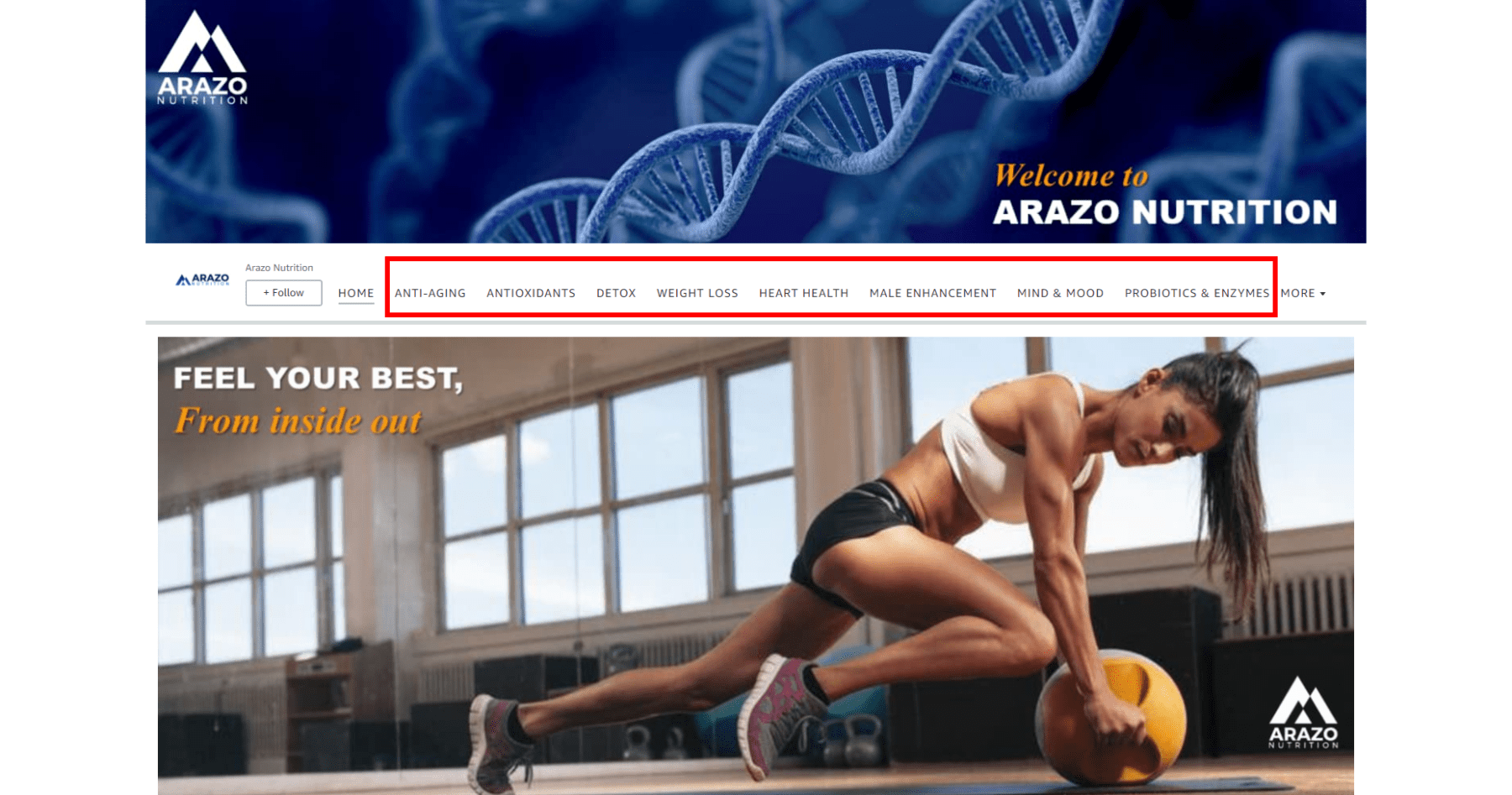
This is a supplement brand, so by laying out the main benefits that the average consumer seeks from a supplement, this brand is acting like a guide that directs consumers to the vitamins, minerals, or compounds that would best serve the consumers’ goals.
Here’s an example of a brand that divided their products based on who they’re for:
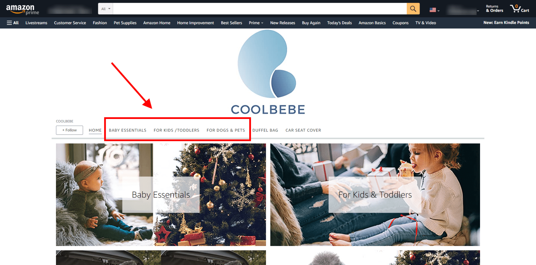
If you have products for different genders, occupations, or age groups, consider labeling your store pages with those differentiators.
Tip #3 – Add Video
Videos are becoming a preferred medium to learn about products. Increasingly, surveys show that consumers would prefer watching a video to learn about products than read about them.
Not only that, but, videos hold the attention better and can often help consumers visualize the benefits better.
With this in mind, consider adding video to your Storefront. Two common ways of using video are demonstrating the product and sharing your brand story and value proposition.
Here’s a Storefront video that demos one of their best selling products:
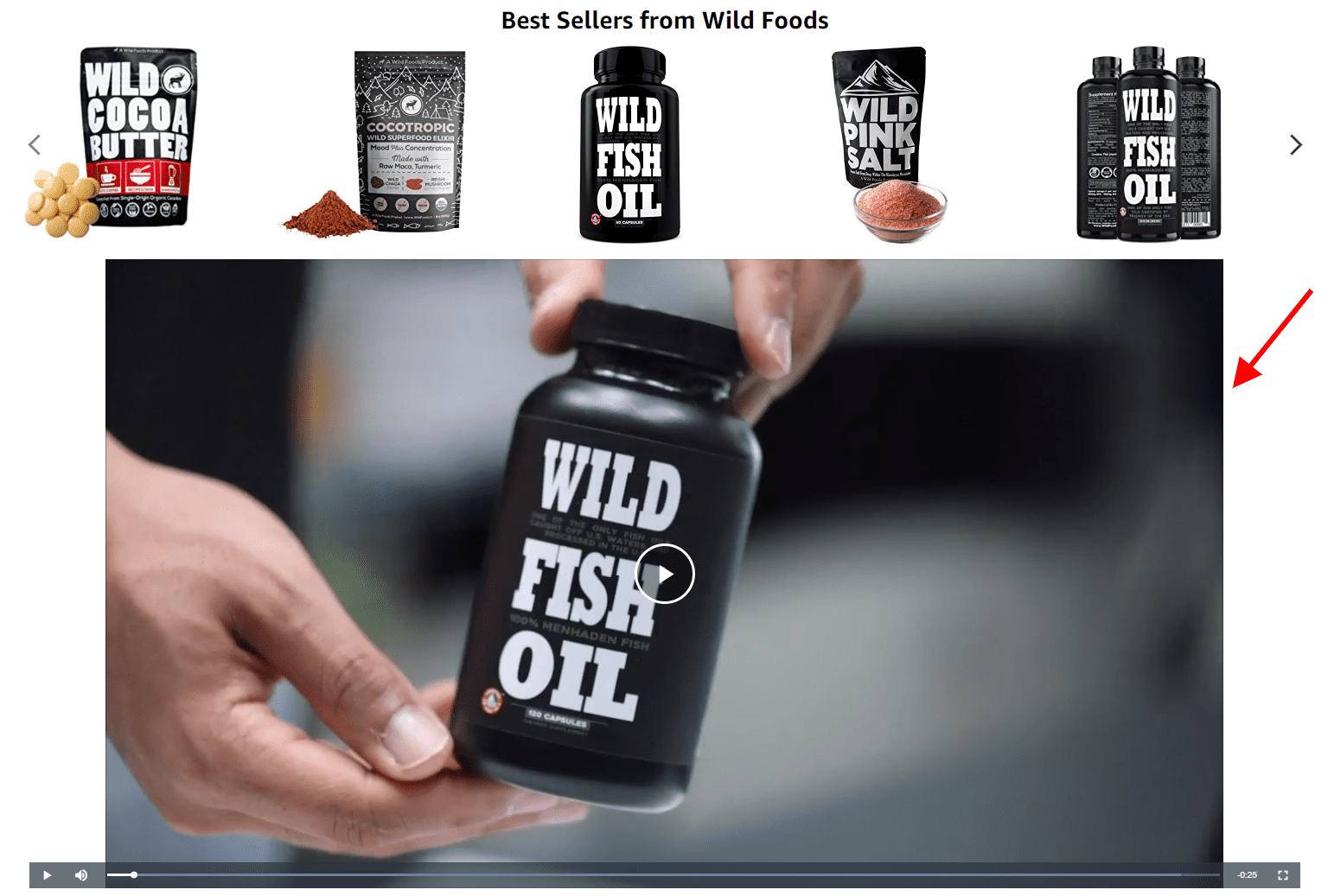
This 25-second video shows a person opening the bottle and shaking it to show that the fish oil capsules don’t stick together (which is a common complaint), then it lists out the ingredients—to highlight the product’s purity—and the benefits of fish oil.
Here’s a Storefront video that expounds on the brand’s eco-friendly value proposition—which they also mention in their header image:
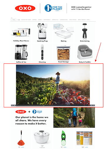
This 60-second video shows happy families cooking and eating food, and footage of beautiful landscapes, with a narrator explaining the brand’s commitment and donations to eco-friendly causes.
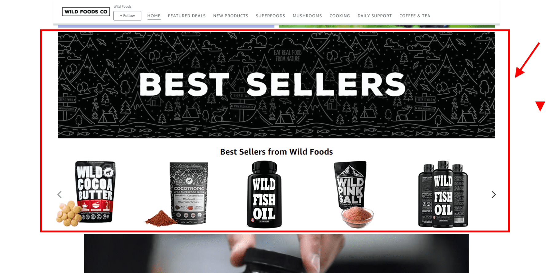
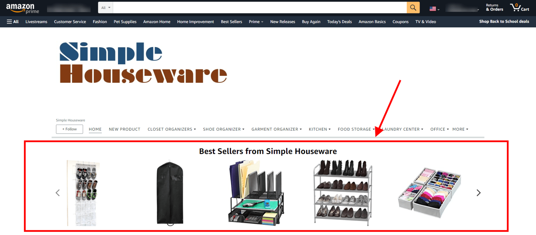
Tip #4 – Best Sellers Catalog
Consumers want to know what other consumers are doing. It’s called “the bandwagon effect.” Besides displaying your product categories, consider having a homepage section and/or dedicated page that displays your best-selling products.
This can be especially helpful if your product catalog mainly consists of products in the same category. Displaying the best sellers can help consumers make decisions on where to start.
Here are a few examples of Storefront best-seller sections:
Tip #5 – Header Image
The header image is a valuable piece of real estate that many Amazon stores don’t use to their full advantage.
Your header image shouldn’t just include your logo or brand name, it should also include a value proposition and/or the outcome consumers seek when they purchase products like yours.
Here are a few examples of brand headers being used effectively:
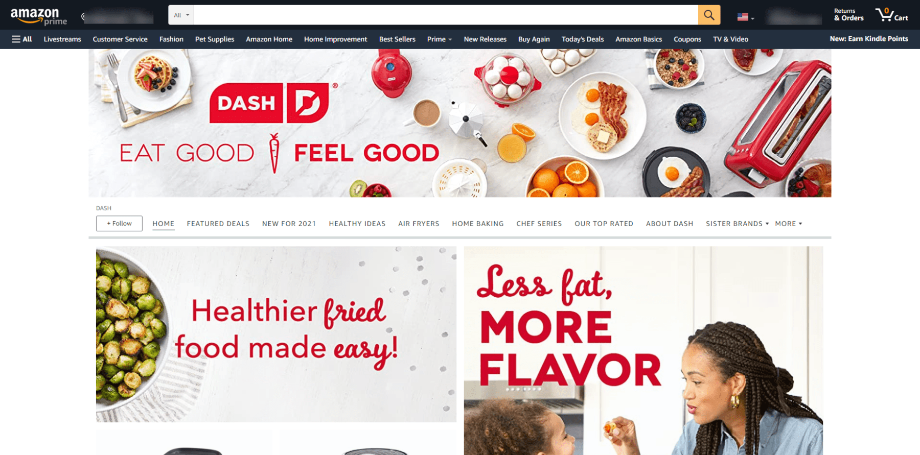
The brand, DASH, sells a line of cooking devices for making low-fat food options. The value proposition is that you can cook yummy foods without a bunch of added fats—a sentiment that follows the guidelines of the traditional DASH diet. The brand conveyed its value proposition front and center with the slogan, “Eat good. Feel good,” in their Storefront header image.
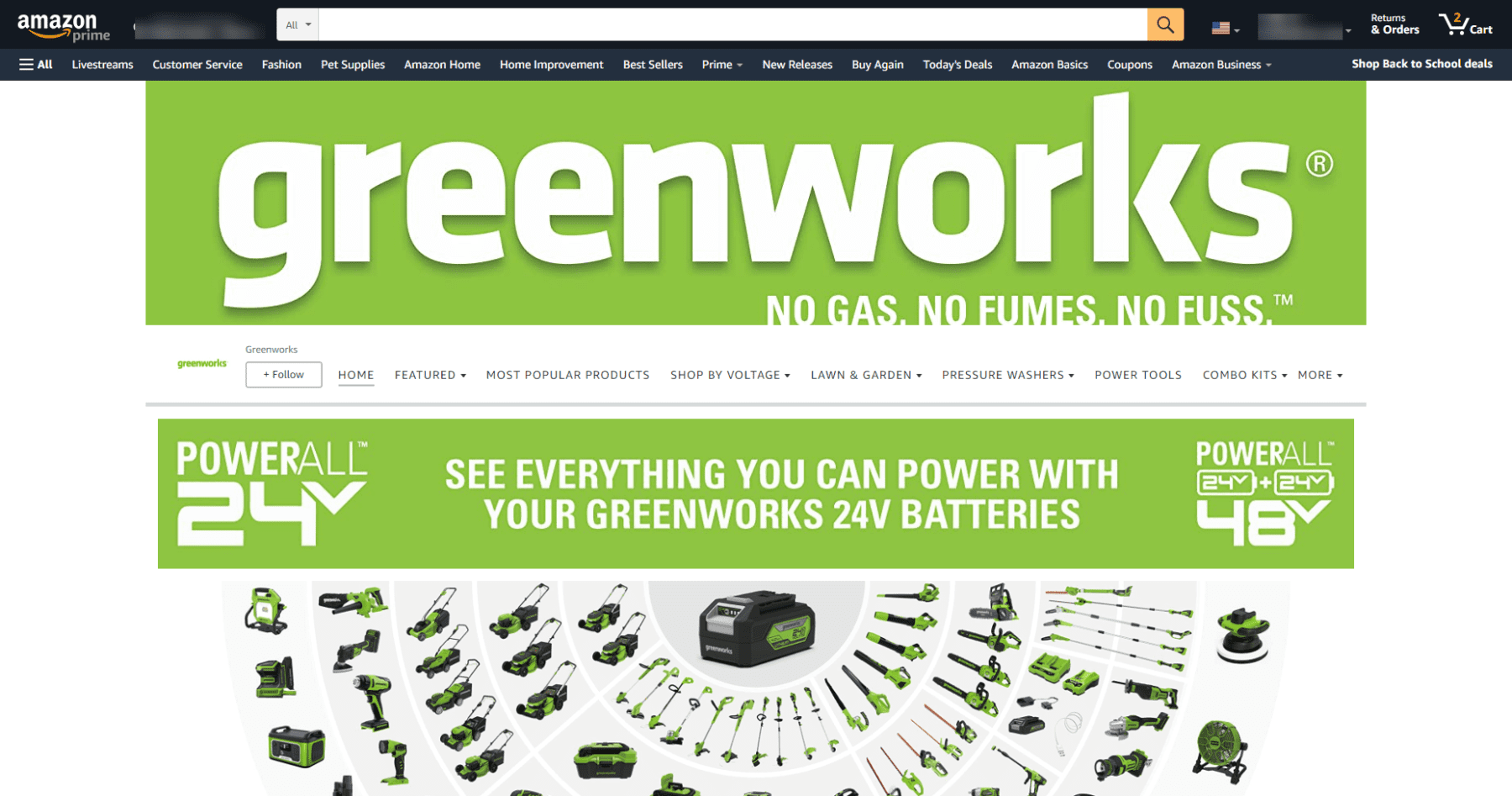
Greenworks sells battery-powered lawn maintenance equipment. They highlight the benefits of battery-powered equipment by reminding prospects of what they avoid dealing with when they use Greenwork products.
Wrapping Up
Now that Amazon’s given third-party sellers a customizable brand-dedicated landing page, the relationship between the brand and consumer can be much more pronounced.
It’s up to you to use this tool (i.e. Amazon Storefronts) to your advantage. Consider taking a few of these tips and updating your Amazon store. You’d be surprised how a few display changes, that make your store easier to navigate, can help you boost conversions and increase your brand loyalty.
Happy Selling,
The Page.One Team
The Last Word:
Amazon customers see catalogs all over the Amazon website. That’s why your Storefront should be much more than a catalog. It should connect the dots between the products you sell and communicate the value you add to the marketplace. If you view your Storefront from that perspective, you’ll likely make better decisions on how to layout your store.