Optimizing Your Amazon Listing for Mobile Shoppers

While online shopping has steadily increased over the last decade, what’s becoming increasingly common is mobile shopping.
According to Business Insider, from 2020 to 2021, mobile commerce sales increased 15.2% to $359 billion in 2021. Some sources estimate that mobile commerce should more than double in the next 3 years.
This trend is not too surprising as consumer data company Statista estimates that over 80% of the world’s population has smartphones.
While the mobile shopping trend continues to grow, features like one-click purchasing make Amazon an attractive place to shop because it’s easy for shoppers to make purchases without having to enter their credit card details each time.
All things considered, Amazon has done a great job of making its user interface flexible for mobile (called mobile responsive).
The reality is, many brands are still behind on optimizing their websites for mobile users.
Mobile optimization has almost become a competitive edge.
As an Amazon seller, when you’re creating your Amazon listing, you’ll want to consider what the mobile shoppers’ experience is like.

Some surveys indicate that up to 90% of mobile shoppers think the mobile shopping experience could be better. Some shoppers complain that the text on the page is too small. Others complain about picture quality.
If your product listing doesn’t show up in a way that highlights its value at-a-glance, you’re likely missing out on mobile conversions.
In today’s article, we’re going to cover how the four main parts of your Amazon listing appear on mobile, with tips on how to optimize each part. While mobile shopping consists of smartphones and tablets, today, we’re only going to focus on smartphones.
Product Title
In most categories, Amazon allows up to 200 characters for your product title, but shoppers won’t see your full product title on the desktop or mobile search results page.
On desktop devices, they’ll see anywhere from 100 to 135 characters. On mobile, they only see about 80 characters.
That means that when shoppers are scrolling the search results page if you don’t have information in the first 80 characters that are pertinent to their search, they may skip you over.
Here’s an example of how a listing looks on the search results page:
On desktop, the product title is only 132 characters long.
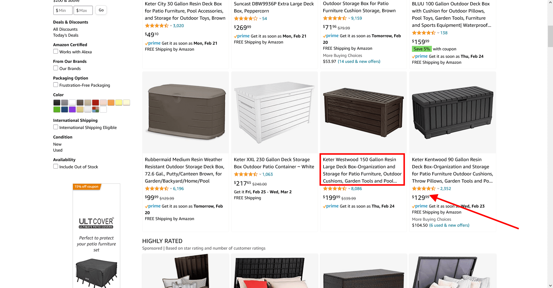
On mobile, it’s 75 characters long.
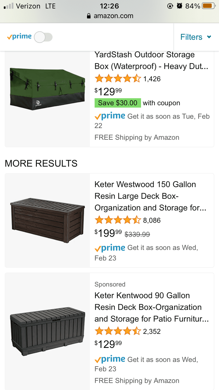
That’s almost half the size.
Notice that the seller placed the size of the unit (a key feature) toward the front of the title?
That’s important.
It helps shoppers know whether your product fits their needs or not. Similarly, if you sold a product with multiple pieces, like a utensil set, you’d want to include how many pieces are in the set toward the front of your listing.
Product Images
Since product titles are shortened on the search results page of mobile, it makes the main product image even more prominent.
When you click on a listing, you won’t see all the product photos readily, you’ll have to swipe left to see all the main product images.
While on desktop, most products have a slot for nine images, you’ll only see seven on mobile.
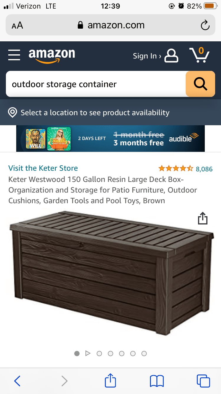
The same best practices from desktop are applied to mobile, but to improve the appearance of your photos, consider making at least a few of your product images vertically proportioned, instead of horizontal.
Product Bullet Points
On each product page, under product images, are the “add to cart” and “buy now” buttons, then below that, you see the product details, including bullet points.
Depending on the length of your bullet points, you’ll see anywhere from one to three bullets. To see the remainder, you’ll have to click “see more product details.”
As an Amazon seller looking to optimize your listing for mobile, you’ll want to make sure the first three bullet points emphasize the benefit of your product and differentiate it from other products.
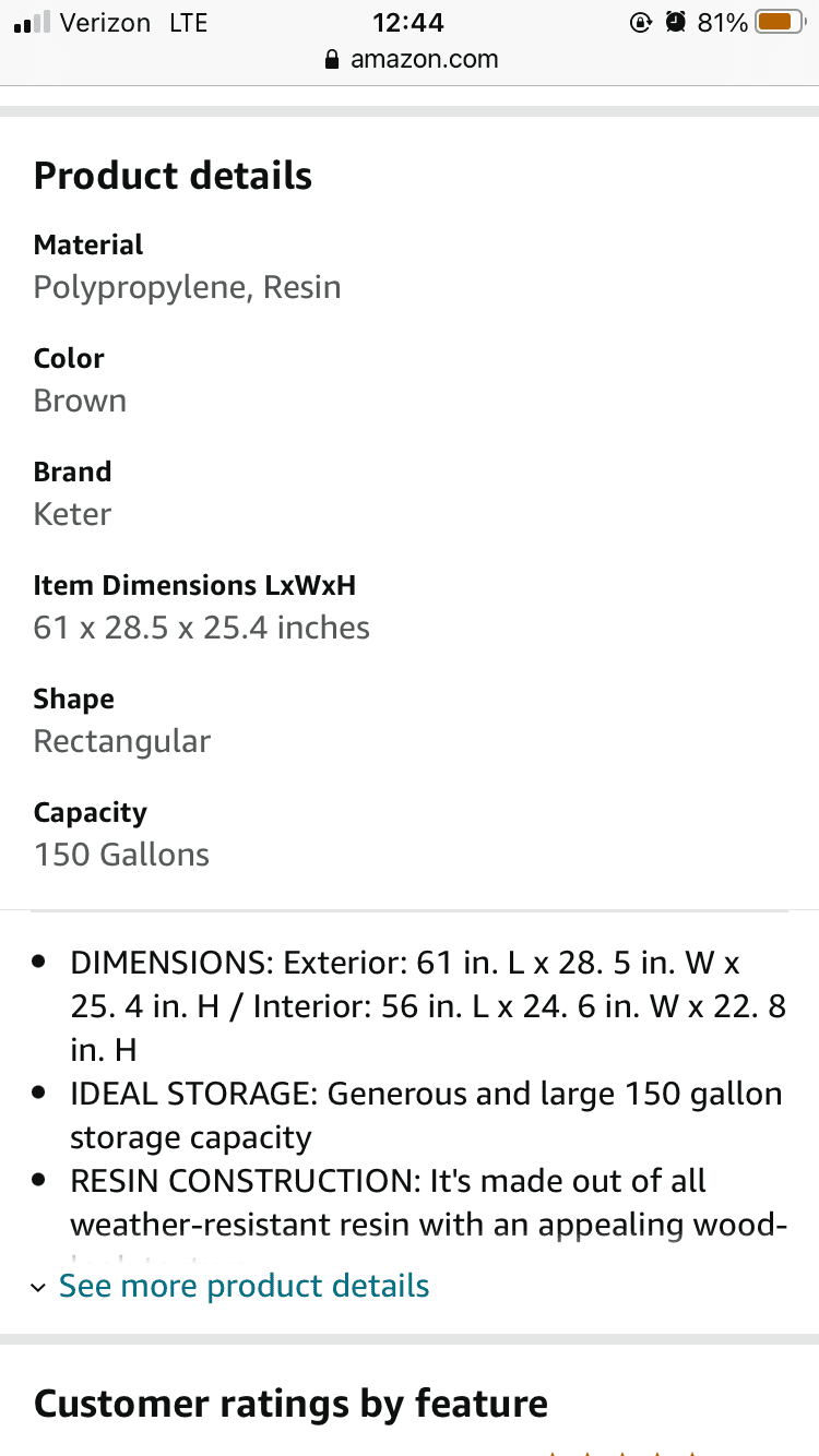
You’ll also want to make sure your product details (material, color, dimensions, etc.) in the back end are complete.
Keep in mind: From the mobile shoppers’ perspective, differentiating products becomes harder because a lot of the information about a product is obscured on mobile.
Make sure the parts of the text that show as a default—e.g., the first three bullet points—clearly communicate why your product is better than the alternatives.
Product Description
On mobile, your product description is further down the page after your bullets and A+ Content.
Just like on desktop, you have your standard text-based product description, and if you’re brand-registered, you may have the more graphic-based A+ content product description. Both appear on mobile.
A+ Content
A+ Content becomes even more valuable on mobile. Without it, you have a lot of text and your standard images, but the remainder of the images on the page are mostly of other sellers’ products in the form of product carousels.
To keep shoppers on your listing, give them more things to evaluate with A+ Content.
For your A+ Content, you’re better off using images and text-based modules instead of images alone. While images are attractive, the scrolling shopper may not assimilate what those images are trying to portray.
One thing you’ll also want to be watchful of is using text on your A+ Content images. On mobile, it can be hard to read.
Here’s an example.

Instead, keep the text and image separate:
Standard Product Description
For the standard text-based product description, some of the text will be displayed on the page, but the number of characters that are shown by default varies. Shoppers will need to click “show more” or “see more” to read the full text.
To improve the readability of your product description, use the HTML code <br> to create line breaks so that your description doesn’t appear like a wall of text as it does in the image below.
Wrapping Up
Most Amazon FBA sellers don’t think about the mobile shopping experience. Many sellers assume that Amazon will optimize their listing for mobile, and while they do, there are still tweaks sellers should make to optimize the mobile experience.
The good news is, when you optimize your Amazon listing for mobile shoppers, you inadvertently improve the quality of your desktop listing too because a lot of the adjustments you make for mobile has to do with sequencing.
For instance, make sure your first three bullets communicate a differentiated value proposition. And make sure your product description is highly readable and starts with the most captivating information.
When you take the time to optimize your listing for mobile, you may be surprised to find a noteworthy boost in sales.
Happy Selling,
The Page.One Team
The Last Word:
The Amazon mobile experience differs based on device. Some screens are larger than others. Some shoppers use magnification. You can’t control those factors, but you want to be aware of how your listing looks across devices by using tools like responsivepx.com.